Keep connected
Our investment management team is made up of engaged thought leaders. Get their latest commentary and stay informed of their frequent media interviews, all delivered to your inbox.
John Zechner
September 28, 2020
High growth stocks would also see continued outflows in that ‘slightly higher rates’ scenario and we believe we would see a shift towards financial stocks, which have dramatically lagged the recovery since March and remain down between 30-40% so far in 2020. After the massive provisions taken in the second quarter, we believe that most U.S. and Canadian banks have more than ample reserves for expected losses and could end up taking back some of those provisions as earnings. Moreover, their wealth management businesses have continued to grow despite the pandemic while strong trading activity and a robust stock market for new financings have been a tailwind for the major investment banks. In Canada we have added to positions in CIBC, Bank of Montreal and Manulife while, in the U.S., we have gone with the three big money center banks; JP Morgan, Citi and Bank of America.
On the economic front, forecasters have been taking note of the steady run of high-side economic surprises. The latest Blue Chip survey reveals that the consensus call on U.S. GDP growth is now a drop of 4.6% this year (up from the low of -6.1% three months ago), and a rebound of 3.8% in 2021. Similarly, forecasts are nudging up overseas. China looks to be one of the rare economies headed for outright growth this year, with GDP likely to be up at least 2%. Germany, too, is seeing a rebound in exports, a big reason GDP forecasts are being lifted there as well and is one reason why the ECB lifted its view on the Euro Area economy to -8% for 2020, while looking for a 5% rebound next year. Britain will still post one of the biggest declines this year due to a sharp first-half plunge. One caveat though is that the overwhelming factor behind the generally positive surprises for economic data has been the tidal wave of government support. Essentially, transfer payments have kept households whole, and in some cases more than making up for lost wages. That has certainly been the case in the U.S. and Canada, where disposable incomes have actually accelerated this year versus what is typically the case in a downturn. In Canada, the spike in income and savings helped carve deeply into closely-watched household debt/income ratios. Along with a slowing in debt growth, the ratio fell to just below 167%, down nearly 8 points from last year’s record high. But that support didn’t come without its costs as the ‘flip side’ is that government gross debt/GDP fired up 18 percentage points to above 132%!
In the U.S., debt has reached its highest level compared to the size of the economy since World War II and is projected to exceed it next year, the result of a giant fiscal response to the coronavirus pandemic. That would put the U.S. in the company of a handful of nations with debt loads that exceed their economies, including Japan, Italy and Greece. The enormous deficit is bringing the federal debt near levels not experienced since the end of World War II, when explosive borrowing to finance the war effort caused a historic spike. But those levels quickly receded during the postwar boom — something that won’t happen now, since federal spending is now dominated by retirement programs like Medicare and Social Security, whose costs increase automatically with inflation and the ongoing retirement of the Baby Boom generation. Also, population growth has stagnated in North America as birth rates decline. Growing population (the ‘baby boom’) kept growth strong post WW2 as did the massive increase in immigration from ‘war-torn Europe.’ Increasing immigration in the U.S. does not look like a strong likelihood, particularly given the current US administration.
Among the many ongoing debates between investment strategists, one of the most followed has been the question of ‘what type of economic recovery will there be and what letter of the alphabet best suits it? While chatter about a ‘V-shaped’ recovery has faded a bit and been replaced by the slower growth ‘U-shaped’ or even ‘no growth L-shaped.’ A more interesting and perhaps more appropriate description is the ‘K-shaped’ recovery, which pays heed to the clear differences we have seen in the recoveries of different industries and sectors and which has accelerated the disparities between the ‘have’ and ‘have-not’ sectors of the economy. While this is more of a political rather than an economic discussion, it does merit attention for investors given the impact on markets and the upcoming election in the U.S.
We can start by looking at the meteoric surge of the stock market since late March, compared to the rest of the economy, where over fourteen million Americans and one million Canadians remain out of work and scores of small and medium-sized retail and service businesses have had to shut their doors. While the market soared to new heights, GDP plunged at its most ever at an annualized rate, unemployment, while falling, remains a problem particularly in lower income groups, and thousands of small businesses have failed during the pandemic. That in itself exacerbates inequality at a time when 52% of stocks and mutual funds are owned by the top 1% of earners. The chart below shows how this ‘wealth inequality’ has grown over the past decades despite movements such as Occupy Wall Street (OWS), which was a protest movement that began in New York City’s Wall Street financial district, in September 2011. It gave rise to the wider Occupy movement in the United States and other countries. The main issues raised by Occupy Wall Street were social and economic inequality, greed, corruption and the undue influence of corporations on government—particularly from the financial services sector. The OWS slogan, “We are the 99%”, refers to income and wealth inequality in the U.S. between the wealthiest 1% and the rest of the population. The disparity has only widened even after the OWS movement began and it really feels like it has only gotten worse in 2020 as stock markets soars ahead while unemployment surged to record levels!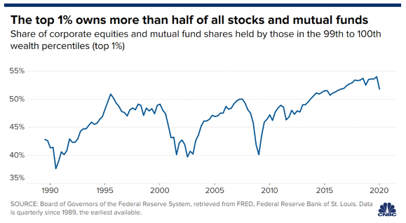
In the world of commodities, we still like gold and silver longer term, but are concerned that the U.S. dollar is in the process of staging a ‘bear market rally’ as investors were lined up too bearishly against the U.S. dollar after its sharp fall since late April. We look to add back to precious metals on any further weakness as the Gold index is down about 15% from its August high. We view the sell-off as a correction in a rising gold bull market rather than the start of a more bearish outlook for gold. With $64 trillion in global debt yielding less than 1%, we believe gold provides a hedge against return-free risk. Our top holdings in the sector include B2Gold, Kirkland Lake Gold and Torex Gold as well as two major U.S. precious metals ETFs; SLV, the iShares silver ETF and GDX, the Vaneck Vectors ETF Gold Trust.
1 2
Our investment management team is made up of engaged thought leaders. Get their latest commentary and stay informed of their frequent media interviews, all delivered to your inbox.